Posted: Tue May 11 2010
Look at a map of Tokyo long enough, and you might start to see the resemblance between the city’s train lines and the circulatory system in an anatomical diagram. If the lines are the veins and arteries, then just as we have red and white blood cells – and even platelets – travelling from one neighbourhood of our body to the next, the trains zipping along Tokyo's tracks come in a variety of colours, shapes, and sizes depending on which line they run. This time around we are on the lookout for trains with an unusual face.
It’s all about profile

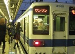
This above shot is of the Tobu 50000 series, which runs on the Tobu Isesaki Line, Tobu Tojo Line and Tokyo Metro Hanzomon Line (as well as other lines). The box-like shape is probably the profile people most commonly associate with trains; it certainly makes sense to make the train as big as law allows in order for it to carry the maximum number of passengers, thus the basic square train carriage shape. That said, high-speed trains such as the bullet train, have a streamlined shape at the front of the train, a design element devised to help minimise wind resistance.

Some commuter trains have convex-shaped carriages, as in this photo. The idea behind this design was purely aesthetic – to improve the image of various train routes by giving the trains some character. These convex silhouette trains run on the subway Toei Asakusa Line, the Keisei Line, the Hokuso Line and the Keihin Kyuko Line. This design has virtually no effect on reducing wind resistance, and doesn’t really need to because these trains run at low speeds.

This is a picture of the Tokyo Metro 10000 series train which was introduced in 2006. It runs on the Tokyo Metro Yurakucho Line, Fukutoshin Line, Tobu Tojo Line, and the Seibu Ikebukuro Line. This rounded shape is popular as another one of those design-only elements. The extent of this design even goes as far as the spherical shape on the front of the train.
‘Egg’ is the keyword for a child friendly train

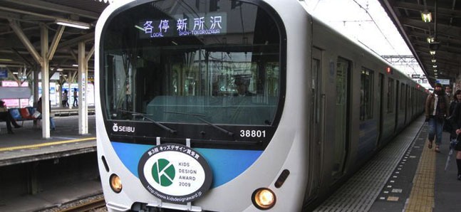
This is the Seibu 30000 series train. It was introduced in 2008 and can be seen on the Seibu Shinjuku Line and the Ikebukuro Line. This train may not have the fashionable round shape that is all the rage in train design at the moment; however, the train’s body has been designed with an overall curve. The theme for this train is based on the idea of an egg, which also explains the egg shape cut out on its front.

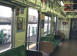
The rounded shape is continued on the inside, too, right down to the straps. General seating gets white straps, and priority seating areas have orange.

This door allows passengers to travel between carriages. The glass makes for better general lighting and ambience, as well as creating the illusion of more space. The eggs appear on the glass to remind people not to walk straight on through. The pattern differs depending on the train, and some trains are said to have a pattern featuring a cracked egg or a chick hatching, though we are yet to find them. Consider yourself lucky if you see one of these on your train.

If you take a closer look, you might find that the glass partition is unusually low. It has been designed this way so that all the little kids who want to see the driver get the best view on the train. These child friendly features came about from Seibu Railways’ female employees having a hand in the train design.

As a result, in 2009 the Seibu 30000 series train won the ‘Kids Design Award’, commending it for its child friendly design. Until now this award has only been given for the design of electrical goods, architecture and toys – making it the first time the award has been given to a train. All children, particularly boys, are fascinated by trains at some point, so if this sort of child friendly train increases, there is no doubt that a child’s first ride on a train could be a very memorable experience. And of course, even grown-ups will get a bit of excitement too.
Tweets
- About Us |
- Work for Time Out |
- Send us info |
- Advertising |
- Mobile edition |
- Terms & Conditions |
- Privacy policy |
- Contact Us
Copyright © 2014 Time Out Tokyo





Add your comment